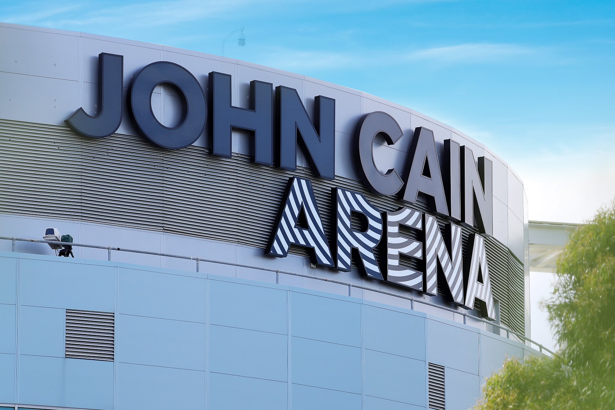
Brand identity design for a venue that honours legacy and reflects the power of performance at Melbourne Olympic Park.
John Cain Arena
Brand Identity Design
The challenge
Since its opening in 2000, this $65 million arena, was developed as a flexible multipurpose venue to support the growing needs of the Melbourne & Olympic Park (M&OP) precinct. Having been known under a variety of names over the years including Vodafone Arena, Hisense Arena and Melbourne Arena, the venue was renamed in honour of Victoria’s 41st Premier – John Cain. A man whose vision laid the foundations for the precinct and shaped Melbourne as Australia’s home of sport and entertainment, securing the Australian Open in Melbourne for generations to come. The challenge was to create a brand identity for the arena which respects and pays homage to the incredible legacy of John Cain, whilst acknowledging the important role the venue plays in Melbourne’s sport and entertainment landscape.
DESIGN IMPACT
The solution for the identity was conceived to reflect two fundamental aspects of the brands essence. The first, a respect for John Cain and his incredible contribution to Victoria and the precinct, which comes across in the bold, confident and timeless quality of the typography. The second, is to reflect the spirit, energy and emotion of the arena, which comes across through the hundreds of events held there every year. This is expressed through the graphic pattern running through the ‘ARENA’. Inspired by the idea of a sound wave, the pattern not only activates the word, but serves as the foundation for the brand’s visual look and feel enabling easy implementation and extension across a wide variety of channels and applications. The result is a brand impression which has been quickly embraced by key stakeholders and the community alike, setting a benchmark across the precinct and defining new sense of place for the arena.


